
Anúncios
Nature’s vibrant spectrum offers endless inspiration for designers seeking to craft palettes that celebrate biodiversity and ecological harmony in creative projects.
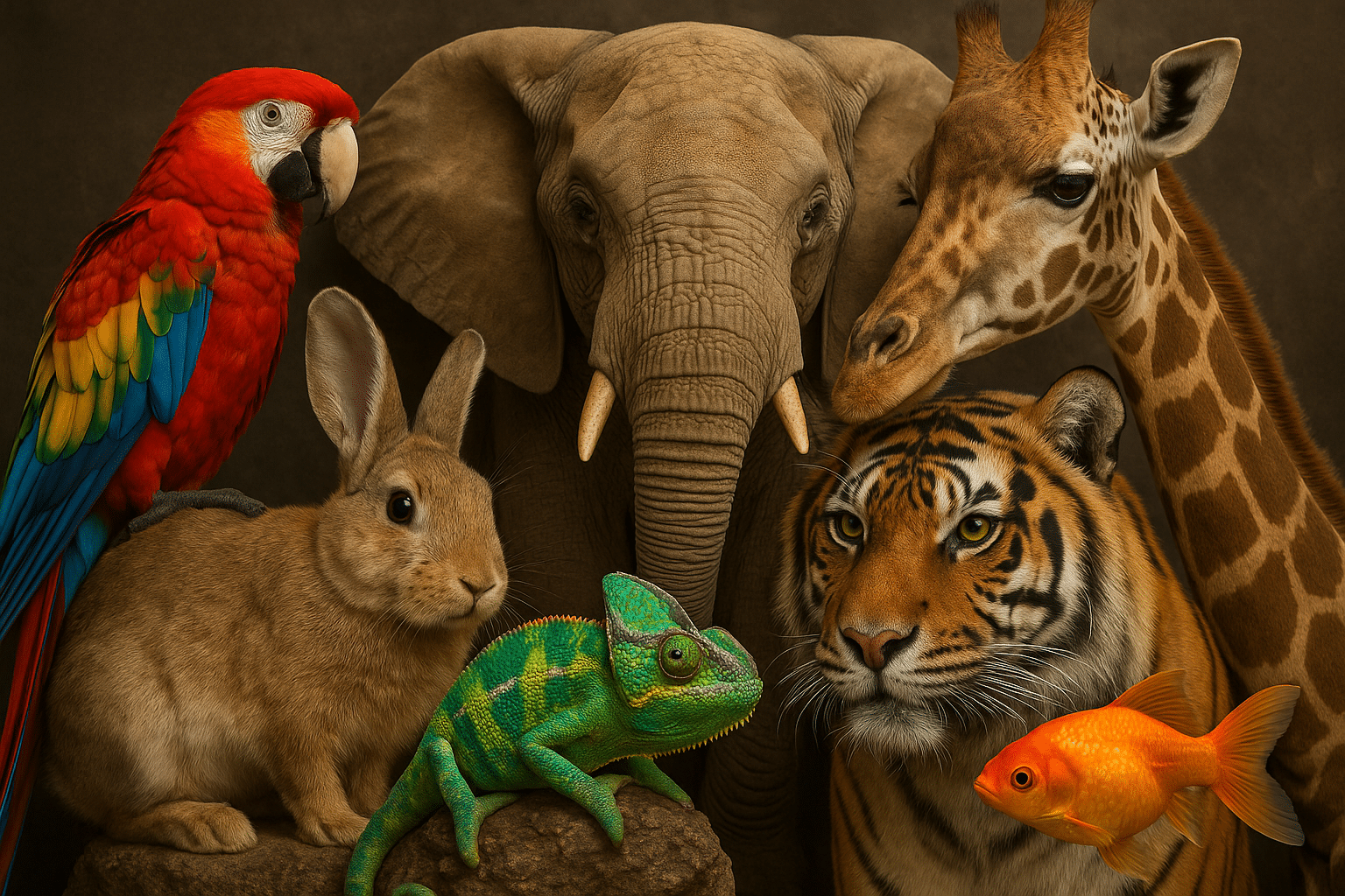
🎨 The Living Canvas: Where Biology Meets Design
When we observe the natural world through the lens of color theory, we discover an extraordinary laboratory of chromatic possibilities. Every species, from the tiniest insect to the largest mammal, carries its own unique color signature developed through millions of years of evolution. These biological palettes aren’t just aesthetically pleasing—they’re functionally optimized for survival, communication, and reproduction.
Anúncios
The relationship between species diversity and color variation provides designers with an unparalleled resource. Coral reefs showcase thousands of hues in a single ecosystem, rainforest canopies display gradients of green punctuated by brilliant flowers, and even desert landscapes reveal subtle earth tones that shift dramatically with changing light.
By studying these natural color combinations, designers can move beyond conventional color wheels and trending palettes to create something truly distinctive. The biological world has already solved countless design challenges through chromatic adaptation, offering ready-made solutions for harmony, contrast, and visual hierarchy.
Underwater Wonders: Mining Ocean Depths for Color Inspiration 🐠
Marine environments present perhaps the richest source of color diversity on Earth. The ocean’s vertical stratification creates distinct color zones, each populated by species adapted to specific light conditions.
Anúncios
Shallow coral reefs burst with electric blues, vibrant oranges, and shocking pinks. Clownfish display bold orange-and-white stripes that create instant visual recognition. Parrotfish shimmer with iridescent turquoise, while sea anemones wave tentacles in shades from burgundy to lime green. These saturated colors work beautifully for brands seeking energetic, youthful identities.
Diving deeper, the color palette shifts dramatically. Bioluminescent species illuminate the midnight zone with ethereal blues, greens, and ghostly whites. Anglerfish dangle glowing lures in the darkness, while jellyfish pulse with translucent phosphorescence. This otherworldly palette suits technology brands, meditation apps, and any project requiring mysterious sophistication.
Creating Marine-Inspired Color Schemes
To capture ocean diversity in your palette, consider combining saturated surface colors with deeper, more muted tones. Pair the electric blue of a damselfish with the sandy beige of a sea floor. Balance the pink of coral polyps against the deep navy of open water. Include metallic or iridescent effects to mimic the light-reflecting scales of pelagic species.
The key is maintaining the natural balance found in marine ecosystems—bright accent colors supported by calming neutral bases. This approach prevents visual overwhelm while preserving vibrancy.
Feathered Brilliance: Avian Color Mastery 🦜
Birds have evolved some of nature’s most sophisticated color displays. Their palettes serve multiple functions—attracting mates, warning predators, camouflaging nests, and signaling health status. This functional diversity makes avian colors particularly versatile for design applications.
Tropical species like macaws and birds of paradise showcase bold primary colors in striking combinations. A scarlet macaw’s plumage combines brilliant red, sunny yellow, and sky blue in proportions that somehow avoid clashing. These birds demonstrate how to use multiple pure hues successfully within a single design.
Temperate zone birds offer more subtle sophistication. The eastern bluebird’s soft cerulean back paired with rusty orange breast creates a complementary scheme that feels both gentle and dynamic. Cardinals provide monochromatic inspiration—their varying shades of red from crimson crest to burgundy tail show how depth emerges within a single color family.
Translating Plumage to Pixels
When adapting bird colors to digital palettes, pay attention to how feathers create gradients through structural color. Many blue and green bird colors result from light interference rather than pigment, producing jewel-like quality that shifts with viewing angle. Recreate this effect digitally through subtle gradients or duotone treatments.
Consider the proportions birds use naturally. Dominant body colors typically cover large areas, with bright accent colors reserved for strategic locations—crests, throats, wing bars. Apply this same ratio principle to your designs, using 60% primary color, 30% secondary, and 10% accent.
Botanical Palettes: The Plant Kingdom’s Color Wisdom 🌿
Plants demonstrate remarkable color strategy, using pigments to attract pollinators, deter herbivores, and maximize photosynthetic efficiency. Flower petals alone present an entire color theory course in living form.
Spring blossoms favor pastels—cherry blossom pink, tulip yellow, lilac purple. These gentle hues appeal to early-season pollinators and create palettes perfect for wellness brands, baby products, and gentle communication. The translucent quality of flower petals adds softness that harsh synthetic colors rarely achieve.
Summer blooms intensify the palette. Sunflowers contribute golden yellows and chocolate browns, creating warm combinations ideal for harvest-themed designs. Poppies add scarlet drama, while lavender fields provide purple-blue serenity. These seasonal transitions offer ready-made color stories for brands needing to communicate growth, abundance, or seasonal change.
Foliage Beyond Basic Green
Leaves deserve special attention for their incredible range within a supposedly limited color family. New spring growth shows chartreuse brightness, mature summer leaves present deep forest greens, autumn foliage explodes into reds and golds, and evergreens maintain blue-green constancy.
Variegated plants add another dimension—hostas splash cream across green, coleus combines burgundy with lime, and croton leaves swirl yellow, orange, and red together. These natural combinations demonstrate successful use of analogous colors with varying saturation and value.
Insect Ingenuity: Small Creatures, Big Color Impact 🦋
Despite their size, insects showcase some of nature’s most innovative color applications. Butterfly wings alone contain more color combinations than most design libraries.
Monarch butterflies demonstrate effective warning coloration—bright orange signals toxicity to predators while remaining visually appealing to humans. This duality makes similar palettes excellent for cautionary designs that need to attract attention without creating panic.
Morpho butterflies produce their brilliant blue through microscopic wing structures rather than pigment, achieving a luminosity synthetic colors struggle to match. This structural color principle inspires metallic and pearlescent effects in modern design, particularly for luxury branding.
Beetles contribute unexpected metallic sheens. Jewel beetles shimmer with emerald and gold, while scarabs display copper and bronze tones. These metallic naturals feel less industrial than silver or chrome, offering warmth alongside sophistication.
Pattern and Color Integration
Insects excel at combining color with pattern. Ladybugs place black spots on red backgrounds for maximum visibility. Bees wear yellow and black stripes that became universally recognized warning symbols. Dragonflies segment their bodies into color blocks that demonstrate effective visual rhythm.
Apply these lessons by pairing your biological color palettes with appropriate patterns. Organic patterns—spots, stripes, gradients—enhance natural color schemes while maintaining coherence.
Mammalian Subtlety: Earth Tones and Natural Neutrals 🦌
Mammals typically employ more subdued palettes than birds or insects, but their colors offer essential lessons in neutrals, camouflage, and seasonal adaptation.
Deer showcase graduated browns from fawn tan to rich mahogany, demonstrating how monochromatic schemes create depth without introducing multiple hues. Foxes combine russet orange with white and black accents, showing how small color additions energize neutral bases.
Arctic species reveal the power of seasonal color change. Arctic foxes shift from brown summer coats to winter white, illustrating how the same species can embody completely different palettes depending on context—a valuable lesson for brands needing seasonal flexibility.
Big cats demonstrate strategic pattern application. Leopard spots break up body outline, while tiger stripes create vertical movement. Both use tawny bases with black markings, proving that limited palettes handled creatively outperform complex schemes executed poorly.
Reptilian and Amphibian Spectrum: Unexpected Color Champions 🦎
Reptiles and amphibians offer color inspiration often overlooked by designers, yet their palettes solve specific visual challenges brilliantly.
Poison dart frogs wear some of nature’s most intense colors—electric blue, brilliant yellow, vivid red, and shocking green. These aposematic (warning) colors demonstrate maximum visibility and memorability, perfect for calls-to-action, alert systems, or any design element requiring immediate attention.
Chameleons famously change color, but their resting palettes deserve study too. They master subtle green variations, blending yellow-greens, blue-greens, and olive tones seamlessly. This teaches gradient creation and smooth transitions between related hues.
Snakes present sophisticated patterning with restrained color. Ball pythons combine black, brown, and gold in geometric patterns that demonstrate rhythm and repetition. Corn snakes add oranges and reds to create warmth without brightness. These palettes work excellently for brands seeking organic feel with controlled energy.
Ecosystem Thinking: Creating Harmonious Multi-Species Palettes 🌍
Individual species provide color inspiration, but observing entire ecosystems reveals how nature balances multiple palettes within shared space. This ecosystem approach helps designers create comprehensive brand color systems rather than isolated palettes.
Consider a tropical rainforest: green dominates as the foundational color, establishing visual consistency. Against this base, colorful species provide calculated contrast—red macaws, blue morpho butterflies, yellow poison dart frogs, orange flowers. Each accent color works because the green foundation unifies everything.
Apply this structure to brand design. Establish a dominant foundational color (like forest green) representing your brand’s core values. Then assign specific accent colors to different brand elements—product lines, service categories, or communication types. This creates diversity within unity, much like natural ecosystems.
Seasonal Palette Rotation
Ecosystems demonstrate dramatic seasonal color shifts. Deciduous forests transition from spring pastels through summer greens to autumn flames and winter grays. Brands can adopt similar seasonal palette variations while maintaining core identity.
Create a primary palette representing your brand’s constant elements, then develop seasonal accent palettes inspired by specific habitats during different times of year. This keeps visual identity fresh while preserving recognition.
Technical Extraction: Capturing Nature’s Colors Accurately 📸
Translating biological colors to digital formats requires careful technique. Natural colors often contain complexity that simple hex codes struggle to capture.
Photography provides the starting point. Photograph specimens in natural lighting to capture true colors. Avoid flash, which flattens tones and eliminates subtle variations. Shoot in RAW format to preserve maximum color information for extraction.
Use color picker tools to sample multiple points from your reference images. Natural colors rarely appear uniform—a red cardinal’s feather contains burgundy shadows, scarlet midtones, and orange highlights. Sample all variations to build complete color families rather than single flat hues.
Test your extracted colors across different media. Colors that look perfect on screen may print differently or appear altered on various devices. Build in slight adjustments to ensure your nature-inspired palette performs consistently across applications.
Accessibility and Biological Color Palettes ♿
Nature’s colors evolved for specific viewing conditions and visual systems that may differ from human perception. When adapting biological palettes for human use, consider accessibility requirements.
Many brilliant natural color combinations—like red and green on certain flowers—create contrast challenges for color-blind users. Test your nature-inspired palettes using color blindness simulators to ensure sufficient contrast ratios for all users.
Supplement color coding with additional visual cues. Nature does this too—poisonous species often combine bright colors with distinctive patterns or textures. Your designs should communicate through multiple channels, not color alone.
Consider the environmental context where your designs appear. Marine palettes heavy on blues work beautifully in bright conditions but may lose definition in low light. Desert palettes with subtle earth tones might wash out on bright screens without sufficient contrast adjustment.
Sustainability Messaging Through Species-Inspired Palettes 🌱
Using diversity-inspired color palettes creates inherent connections to environmental consciousness. Audiences increasingly value brands demonstrating ecological awareness, and your color choices communicate values before words appear.
Brands focusing on sustainability benefit from palettes drawn directly from threatened ecosystems. A palette inspired by coral reefs—with their vibrant but increasingly endangered colors—tells a story about fragility and beauty worth protecting. Similarly, palettes referencing rainforest species implicitly communicate biodiversity value.
Document your palette’s biological inspiration in brand guidelines. Share the species and ecosystems that influenced your colors. This storytelling adds depth to design decisions and creates emotional connections with environmentally conscious audiences.
Consider partnering with conservation organizations whose work protects the species inspiring your palette. This creates authentic sustainability connections and supports the very diversity providing your creative inspiration.

Bringing Biology to Your Next Design Project 🎯
Implementing species-inspired palettes begins with observation. Visit natural history museums, botanical gardens, aquariums, and wildlife preserves. Photograph interesting color combinations. Note which species colors attract your attention and analyze why.
Build a reference library organized by ecosystem, species type, or color family. Include notes about the functional purpose of each natural color—camouflage, warning, attraction, thermoregulation. Understanding color function helps you apply similar strategies to design challenges.
Start small with accent colors before committing to full palette overhauls. Introduce a bird-inspired blue as a new call-to-action color, or test a botanical green in secondary branding elements. Gradual integration allows testing and refinement.
Collaborate with photographers and naturalists who can provide high-quality reference material. Their expertise helps identify accurate colors and understand the biological context behind chromatic choices.
Remember that nature’s palette took millions of years to evolve. Your design won’t achieve perfection immediately. Iterate, test with real users, and refine based on performance data. The natural world offers endless inspiration—return to it repeatedly as your design needs evolve.
By diving into the diversity of species around us, designers tap into color systems optimized by evolution itself. These palettes carry built-in harmony, tested across countless generations for effectiveness. Whether you’re designing a website, crafting a brand identity, or creating digital art, the natural world offers color wisdom waiting to inspire your next project. The most inspiring palettes aren’t invented—they’re discovered in the incredible diversity of life sharing our planet.